Templates
Intro
These pre-made designs and documents are meant to help you meet specific standards and specs. Moreover, they maintain visual consistency across the JCCO organization. In some cases, like social media postings, simply using the official font, official colors and JCCO logo will suffice.
Branch Signs
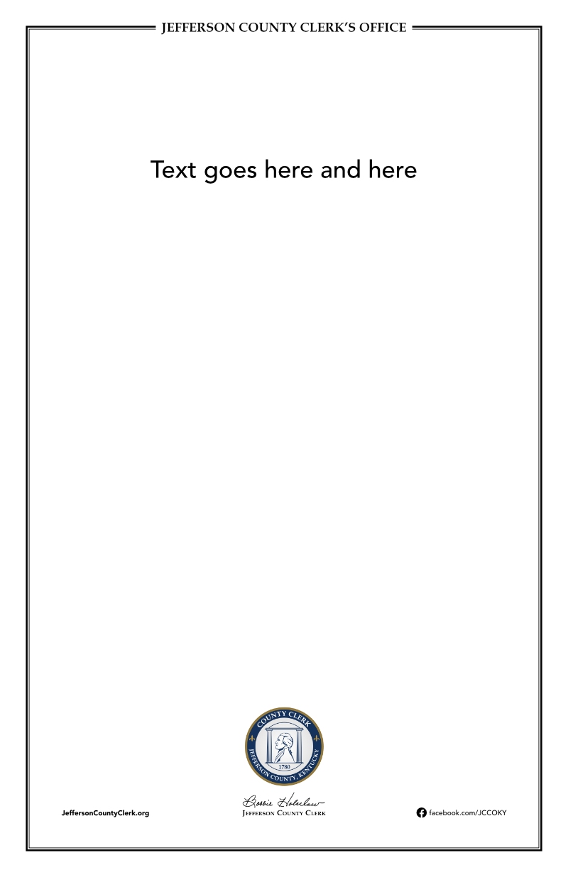
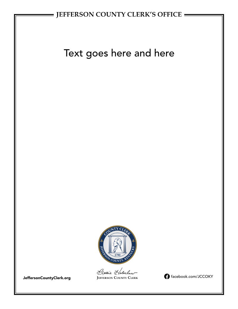
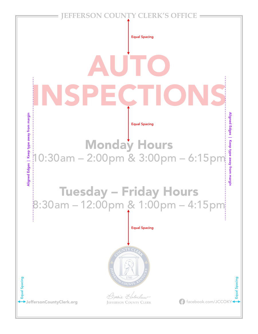
Here are the templates for physical generic flyers/signs for the Motor Vehicle Branches. Try to keep the font size around 26 points or above. If the verbiage greatly exceeds the spacing on a standard 8.5x11 template, then use the 11x17 template. The “Special” template is reserved for identifying special desks, workstations, and services (just the name, no verbiage). See “Layout Guide” section below.
Layout Guide
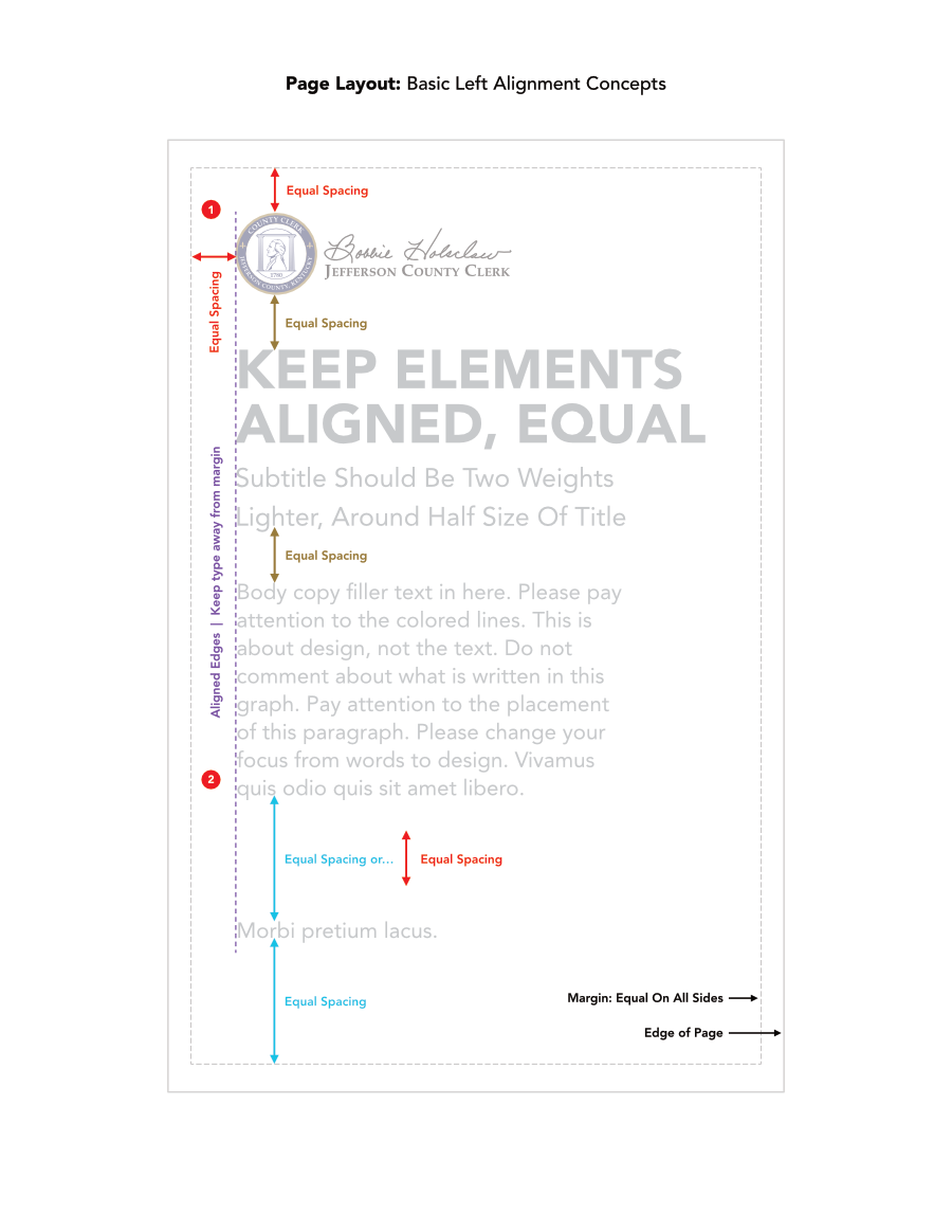
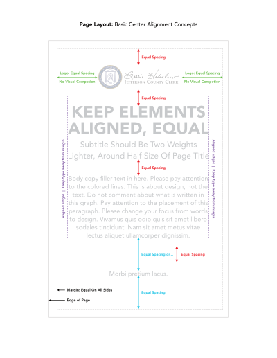
Create equal spacing. And line sh*t up!
Properply spacing content on the page will give it more structure, cohesion and clearer hierarchy. Page layout is generally more pleasing to the eye when it’s evident basic design principles were incorporated.
Web: Basic Guidelines
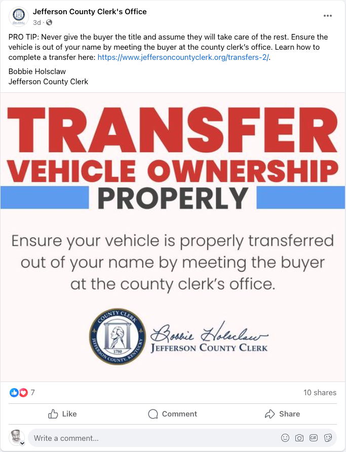
Use the official colors and official fonts. Include the JCCO logo and make sure it’s clearly visible. Refrain from text-heavy designs. Place excessive amounts of text above or below the graphic for easier readability. Do not place text very close to the edge of the graphic. Give ample spacing.
Left example: Notice the space around the text. The JCCO logo is very visible, but does not compete with the title. The blue background is the same color as the blue in the JCCO logo.
Right example: The “Transfer Vehicle Ownership” text is too close to the edge. The left and right edges, and the blue line, should all line up with the edges of the lower paragraph. Doing so will make the overall graphic appear cleaner and uniform. The logo is visible, but does not compete with the messaging.

← BACK
NEXT →



Social Media
Customer Feedback and Elections
Customer feedback posts should have a consistent look/ structure. Specifically, a speech bubble containing the quote from the customer, the branch they visited and the clerk receiving the praise. There should be one design for a long series of posts before changing to a different design if desired.
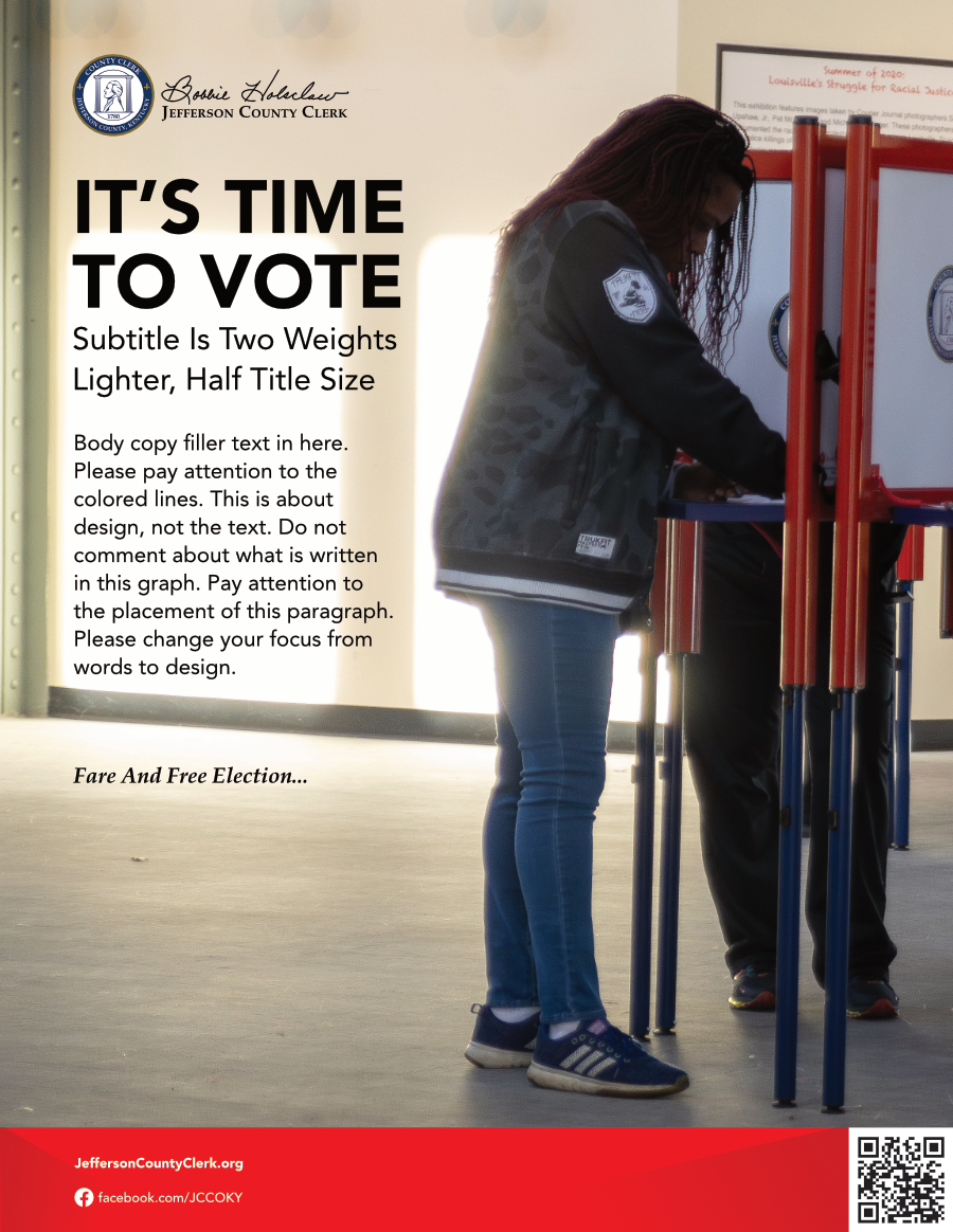
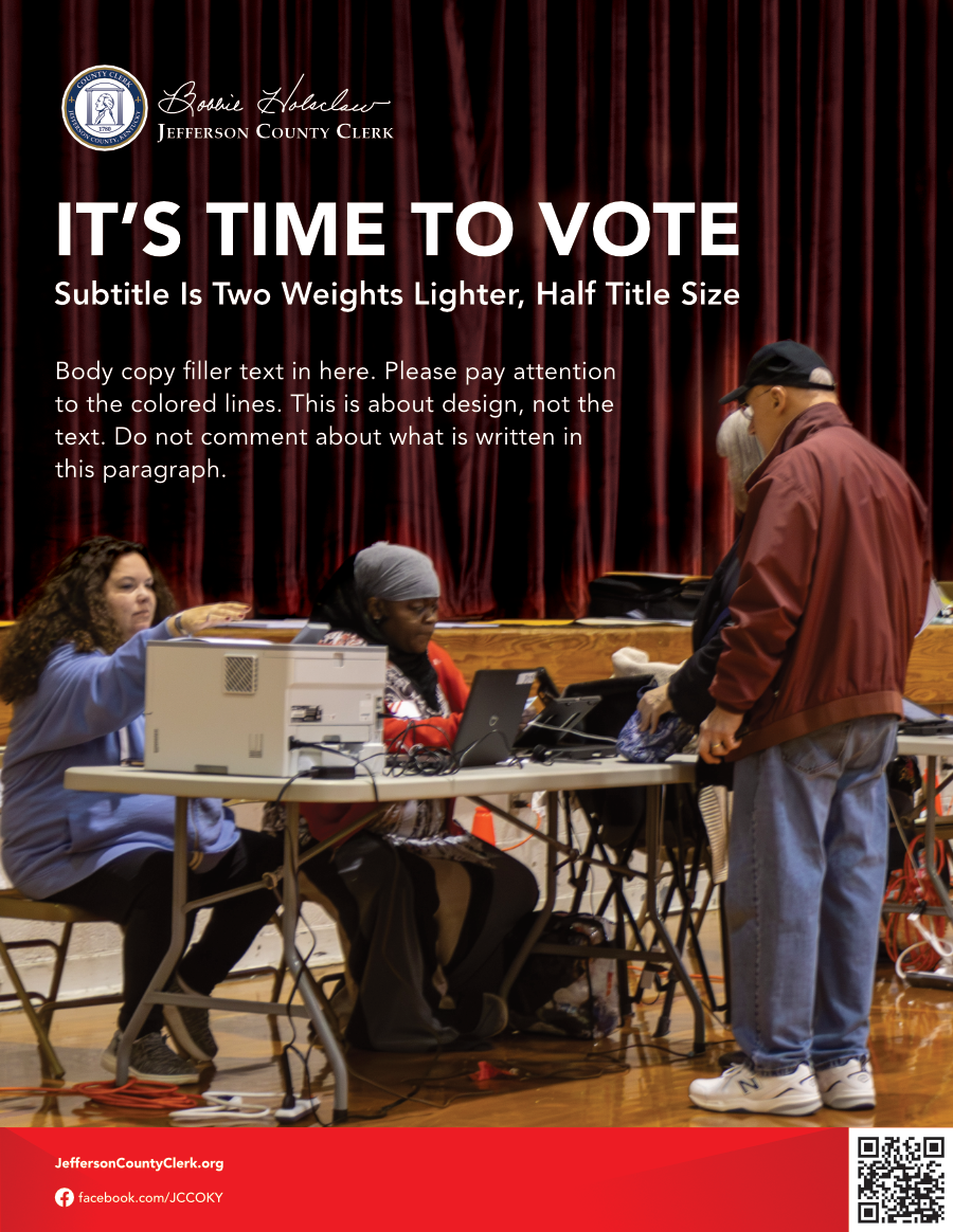
The Admin team prefers a very particular look for election posts. The designs below have been requested by Admin since 2020. Continue using these templates until instructed otherwise by the Admin team.
Other posts
Feel free to exercise broad creativity for other posts, within reason. Be sure to ONLY use the official colors, official fonts and JCCO logo. Please refrain from text-heavy designs. Place excessive amounts of text below the graphic for easier readability.
Customer Comments (Download JPEG)
Square Election Ad (Download Zip)
Landscape Election Ad (Download Zip)